Editor’s choice
Editor’s choice
This story map explains how urban heat islands develop, why they matter and who they affect the most – using Pärnu City and County in Estonia as an example. Through maps, graphs and spatial analysis, it visualizes how heat is distributed across the city and reveals which neighbourhoods and communities may be at greatest risk.
With rising global temperatures, the effects of extreme heat are becoming increasingly severe in cities around the world.
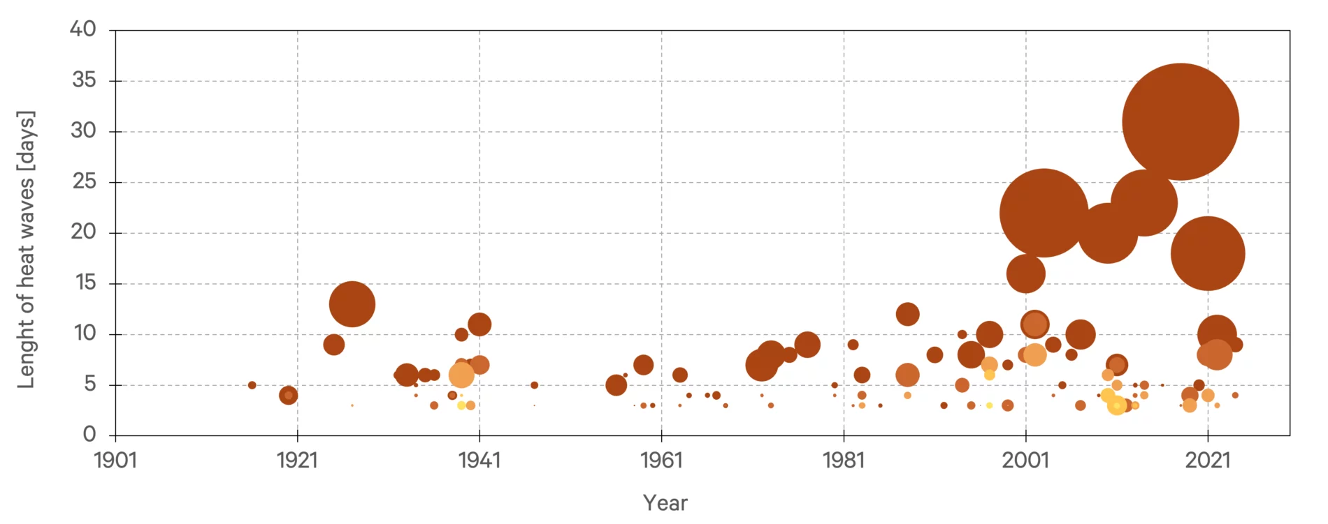
Estonia is no exception. Since 1951, average temperatures in Estonia have been rising by 0.2–0.3°C per decade – above the global average for the same period. Residents have experienced increases in both the frequency and intensity of extreme weather events, including heatwaves. Powerful examples occured in 2010, 2014, 2018, 2021 and 2022.
Figure 1: Length of heatwaves (days) and intensity, 1901–2021
Source: SEI Tallinn.
Heatwaves pose a serious threat to public health. During the summer of 2021, officials recorded an increase in mortality rates in Estonia and identified the record-breaking heatwave as a key factor. According to data from the University of Tartu and the Estonian Environmental Research Centre, an average of more than 36 people die prematurely during heatwaves each year in Estonia’s five largest cities. Vulnerable groups like the elderly, people with chronic diseases, children and pregnant women are disproportionately affected when it comes to extreme heat.
However, rising temperatures alone do not fully explain how heat is experienced in cities. Urban environments can intensify these trends, creating localized hot spots that expose residents to additional stress. To understand why some neighbourhoods feel significantly hotter than others – especially during heatwaves – we need to examine the phenomenon of urban heat islands.
Urban heat islands (UHI) are parts of a city that experience significantly higher temperatures than the greener outskirts. They develop when buildings, roads and other hard surfaces absorb and store heat, while a lack of trees and green spaces limits natural cooling. UHIs are also most noticeable at night, when rural areas cool down quickly and cities stay warm.
While urban heat islands are a global phenomenon, their intensity and impacts vary depending on geography, infrastructure and local climate conditions. Understanding how these factors combine in a real-world setting helps translate theory into practical risk assessment.
Figure 2: Urban heat island profile (example).
Data source: Royal Meteorological Society. Graphic: SEI.
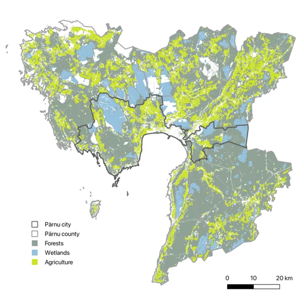
Pärnu County (including Pärnu City) is located along a shallow Baltic Sea bay that warms quickly in summer. During heatwaves, coastal waters around Pärnu City reach among the highest temperatures in northern Europe.
Map of Pärnu County.
Data source: Estonian Land and Spatial Development Board.
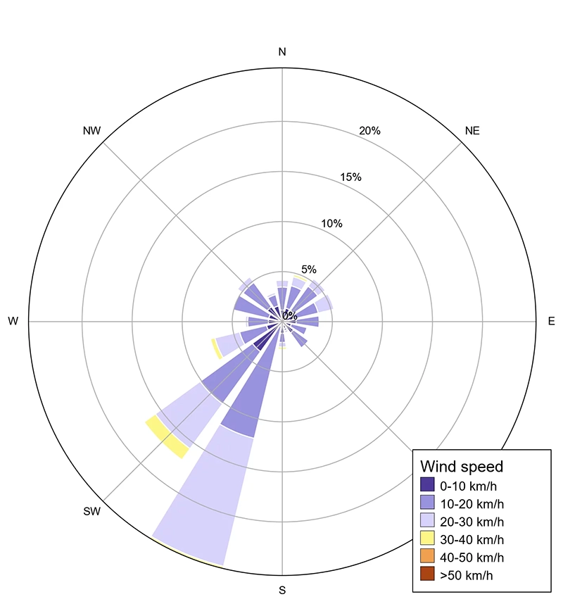
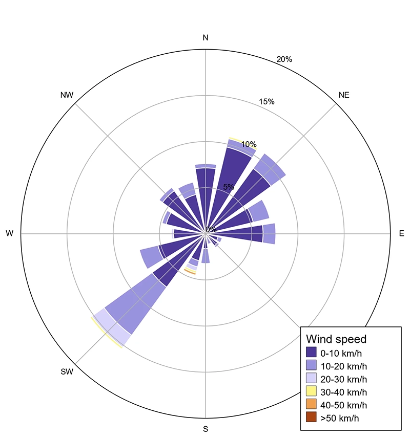
Because of this, Pärnu City experiences a combination of natural heat island effects near the coast and UHI effects, particularly at night, when the sea remains warmer than the land. During hot days, southerly sea breezes offer some cooling, though less than in other Estonian regions where sea temperatures are lower.
Figure 3a: Daytime wind direction and speed in July.
Graphic: SEI.
Figure 3b: Nighttime wind direction and speed in July.
Graphic: SEI.
Pärnu is Estonia’s fourth-largest city and a popular coastal resort. It sees a surge in visitors in summer – precisely when UHI effects are strongest. This seasonal population increase makes understanding temperature exposure even more important, as both residents and tourists may be affected.
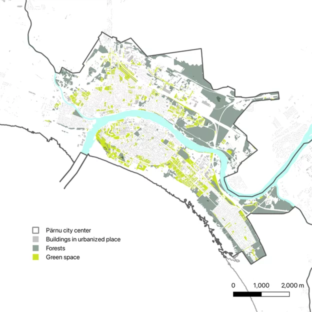
Map of Pärnu City centre.
Data source: Estonian Land and Spatial Development Board. Graphic: SEI.
These overlapping coastal and urban heat dynamics highlight the need for targeted planning and risk assessment. Addressing heat risk requires not only understanding where temperatures rise, but also how those conditions intersect with population patterns and social vulnerability.
Recognizing these challenges, SEI Tallinn and the Regions4Climate project aim to:
To translate these goals into meaningful action, it is essential to understand how heat risk is structured – not only as a physical hazard, but as an interaction between exposure, vulnerability and societal response.
To understand how UHIs affect social groups differently, it is important to clarify several key concepts:
Risk is the potential for severe consequences. It is shaped by the hazard itself, our exposure to it, our vulnerability, and how we respond before, during or after hazard events. Understanding who is most at risk requires examining how these components interact.
Together, these concepts provide a framework for moving from abstract risk definitions to spatial analysis. By mapping hazard, exposure and vulnerability, we can better understand where heat stress is most likely to translate into real-world impacts.
Figure 4: Components of climate risk.
Source: Adapted from IPCC AR6 report.
Methodology note: Normalized land surface temperature was calculated from Landsat images (2014–2021). Z-scores were added to each layer to provide a conservative estimate.
To understand heat patterns, satellite-derived land surface temperatures from several summer days were analysed.
The maps show that the highest proximity to heat is found in areas with greater urban density. Other elevated areas in Pärnu County are mainly due to peat mining. While the dark surface of peat mines warms quickly on sunny days, such patterns are less relevant in a heat island context because there is little or no human exposure.
Figure 5: Day-time heat hazard mapping in Pärnu County based on satellite assessment. Selected days were normalized to show areas with above-average heat at the surface level. The heat intensity shown on the map represents standardised anomalies, meaning how much the land surface temperature at a location deviates from the average (specifically, values above the mean). Unit: standard deviation (SEI, 2025)
Identifying where heat accumulates is only the first step. Risk emerges when these hot zones overlap with where people live and work – particularly where vulnerable populations are concentrated.
By overlaying heat hazard maps with residential zones, we can identify neighbourhoods where people are most exposed to elevated temperatures. This spatial comparison helps reveal which communities may experience disproportionate heat stress.
Figure 6: The residential areas and public areas exposed to the day-time heat hazard. The heat intensity shown on the map represents standardized anomalies, meaning how much the land surface temperature at a location deviates from the average (specifically, values above the mean). Unit: standard deviation (SEI, 2025)
Exposure alone, however, does not determine impact. To understand who may face the greatest consequences, we must examine social vulnerability.
Heat risk depends not only on temperature, but also on who is exposed and how sensitive they are.
One important vulnerability indicator is age. The maps below show the percentage of residents aged 65 and older. Understanding where older adults are concentrated helps identify where targeted interventions may reduce heat-related harm.
Figure 7: The distribution of the residents aged 65+ in Pärnu City and County. (SEI, 2025)
Older adults are highly sensitive to heat. Their highest concentrations are in the centre, with additional clusters in surrounding areas.
A broader picture emerges when multiple sensitive groups are considered together.
Young children and older adults are both highly sensitive to extreme heat. Areas where these groups overlap may face compounded heat-related risks.
Figure 8: Combined distribution of children under 10 and adults over 65 (bi-variate) in Pärnu County. (SEI, 2025)
Examining their combined spatial distribution reveals that vulnerability is uneven across the county. Recognizing these patterns helps planners prioritize interventions where they may have the greatest protective effect.
Other factors contributing to sensitivity include health status, medications, housing quality and physical condition. Adaptive capacity varies as well, influenced by income, education, social networks and access to cooling or public information.
When hazard, exposure and vulnerability are considered together, a more complete understanding of heat risk becomes possible.
Areas at greatest risk are those where:
Risk is therefore not simply the presence of heat, but how heat interacts with human conditions. Comparing land surface temperature with population distribution highlights neighbourhoods where interventions could have the most impact.
This integrated perspective transforms spatial analysis into a practical foundation for action.
Figure 9: Combined map showing population, schools and welfare services in relation to heat exposure in Pärnu County. (SEI, 2025)
Urban heat island effects will continue as the climate warms, but targeted action can reduce their impacts. The patterns identified throughout this analysis point toward coordinated responses across planning, community support and individual preparedness.
Further research will refine vulnerability assessments and risk-related patterns as climate conditions evolve. The maps and analysis presented here serve as a starting point for understanding urban heat dynamics and guiding future resilience efforts.
This social vulnerability assessment is part of the EU-funded Regions4Climate project, which supports Europe’s transition to climate resilience by reducing vulnerability through innovative solutions. SEI Tallinn leads stakeholder engagement and participatory research in Pärnu County (Pärnumaa), monitoring regional climate risks including UHIs.
Andreas Hoy
Senior Expert (Climate Systems and Energy Policy Unit)
Project / Regions4Climate will implement innovative actions to enhance climate resilience within the real-life environments of partner regions.
Perspective / Estonian cities are starting to adapt to climate change – the summer heatwaves make it increasingly dangerous not to.
SEI podcast / Deep dive into the science of shifting heat patterns, the inequalities in who suffers the most, and the lessons from urban design innovations in Asia and Europe
Perspective / Heidi Tuhkanen examines adaptation trends in Europe – what has helped drive change and what needs to happen to break through longstanding bottlenecks.